.CNhas5IL_ZqBJiz.webp)


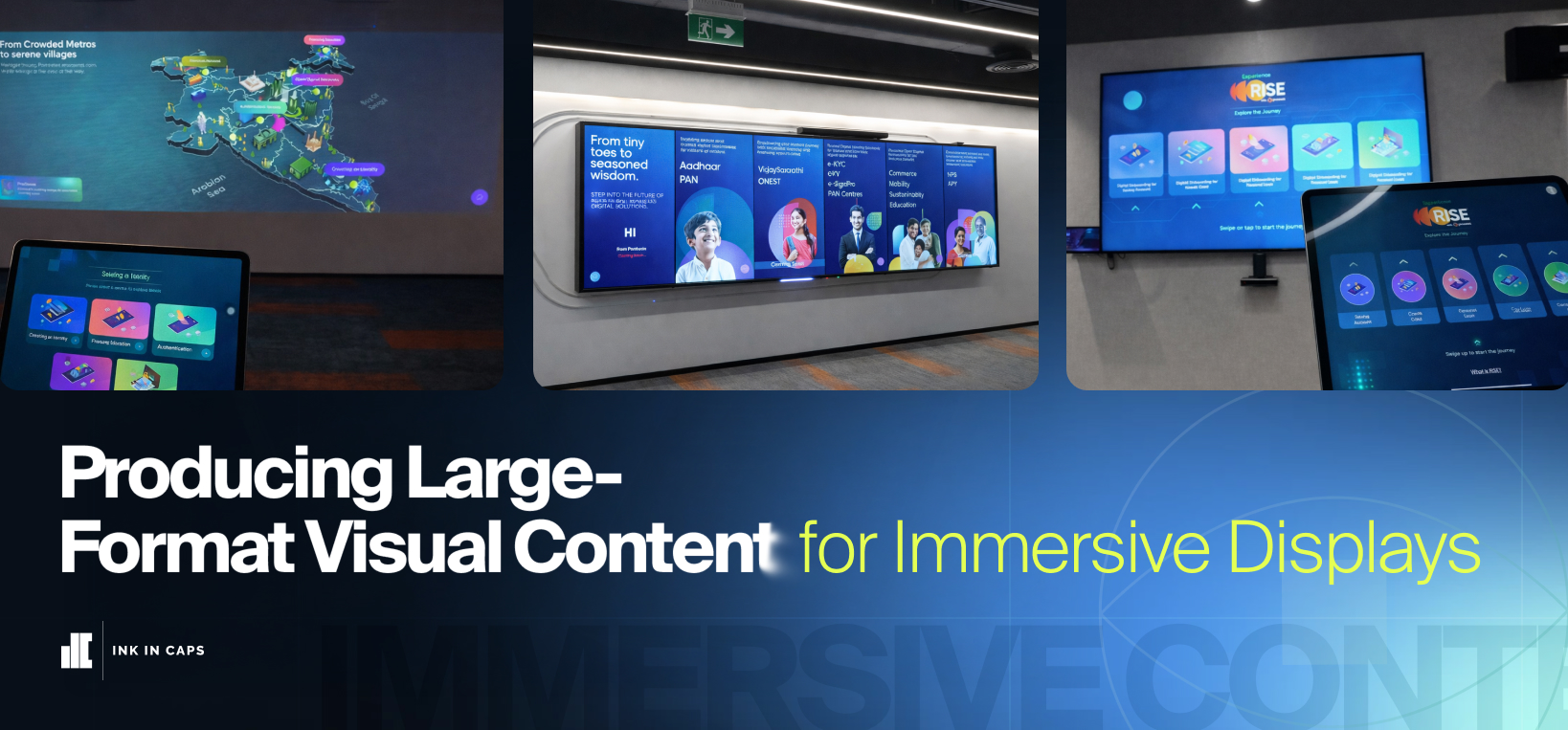
Producing Large-Format Visual Content for Immersive Displays
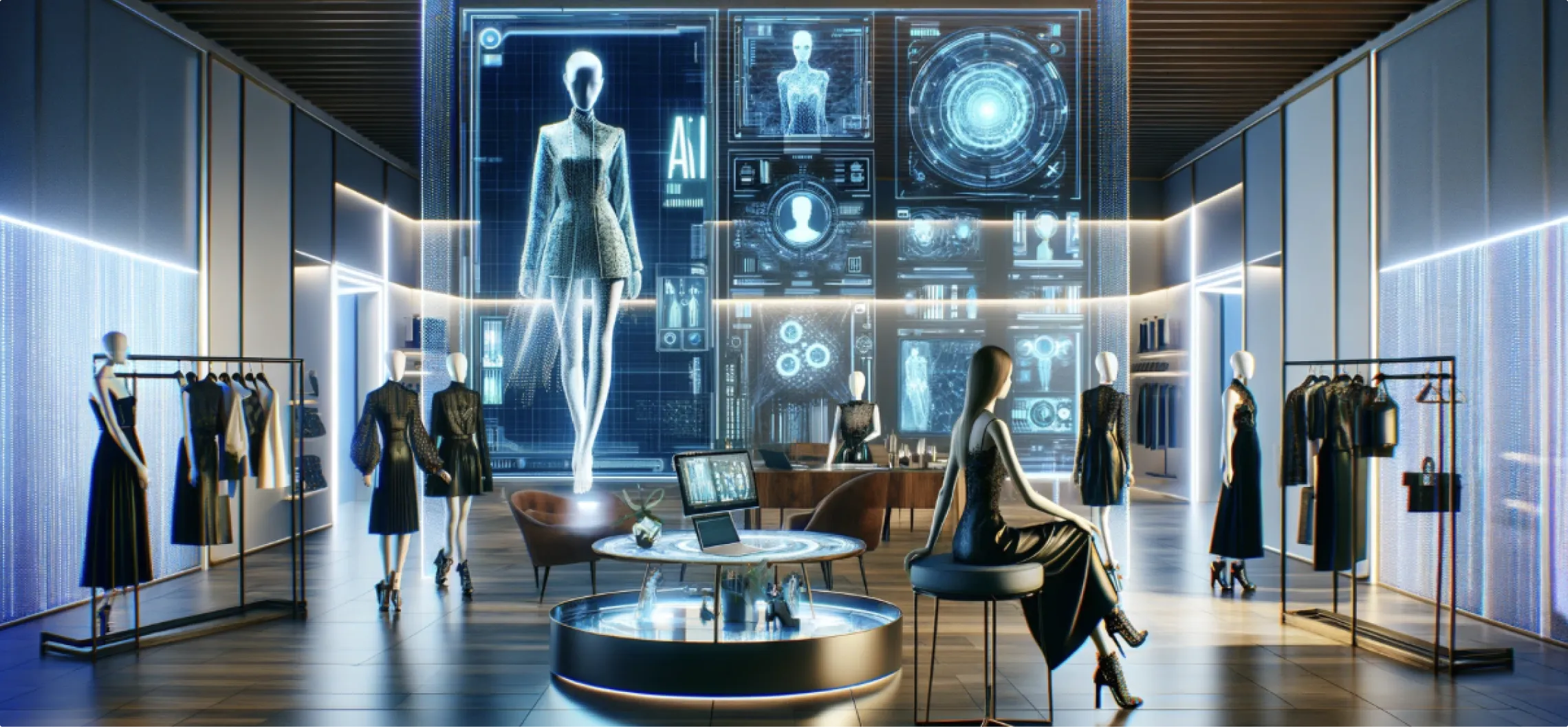
Large-format visual content carries a different responsibility than standard digital content. It must communicate clearly from a distance. It must hold attention in motion. And it must simplify complex information without stripping it of meaning.
In experience centres, the content layer does more than fill screens. It structures the visitor journey, sets the pace, and carries the core narrative from entry to exit.
Content Architecture Before Visual Treatment
Most large-format display projects fail at the planning stage — not the execution stage.
Visual treatment gets prioritised before communication structure. The result is content that looks impressive but communicates nothing durable.
Content architecture must come first. The layout, interaction logic, zone sequencing, and narrative flow must be resolved before a single asset gets designed. This approach ensures that every visual element serves a specific communication role, not just a visual impression.
For any brand operating at institutional scale, this distinction matters.
The Communication Gap in Infrastructure and Enterprise Storytelling
Large enterprises often face the same core problem: the gap between operational scale and audience comprehension.
Systems, platforms, and infrastructure can be extensive. But if that value remains invisible to stakeholders, decision-makers, or partners, the communication effort fails regardless of budget.
The challenge is not displaying information. The challenge is making complex, invisible operations legible — and making them legible in a physical space designed for conversation, decision-making, and trust-building.
This gap shows up consistently across experience centre briefs. The brand has genuine depth. The content flattens it.
Protean Interactive Experience Centre: A Structured Case
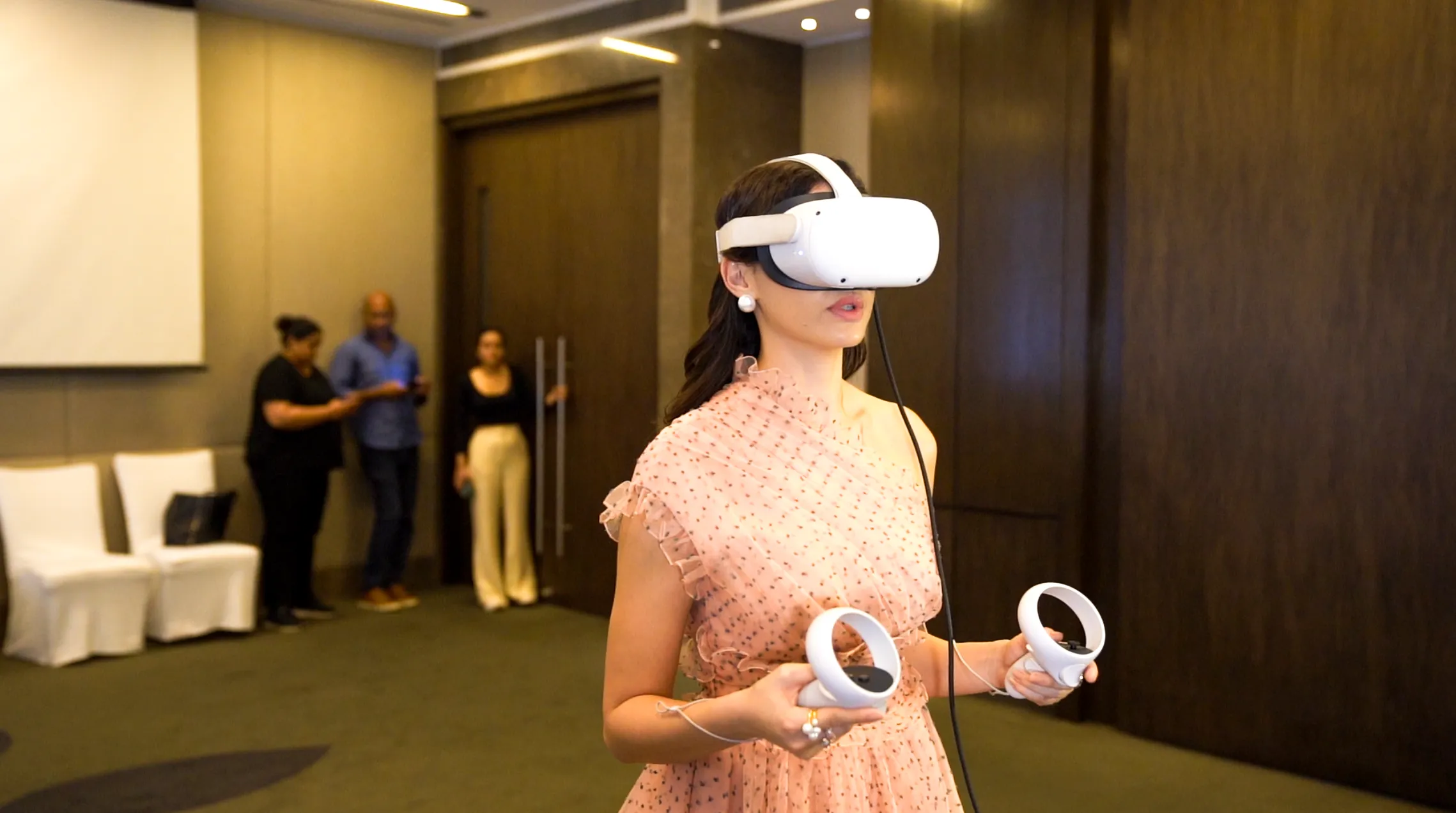
Protean's Interactive Experience Centre addressed this directly. The environment was built across four physical zones and one web-based visitor portal. It consolidated 70,000+ data points into a clear, interactive system with 300+ interaction points across five touch domains.
The brief centred on communicating the scale and role of Protean's Digital Public Infrastructure — across life stages, geographies, and industries. That required a content model capable of handling layered complexity without relying on lengthy explanation.
Zone 1 opened with identity and life stages. Six-screen interactive LEDs connected platforms — PAN, Aadhaar, eKYC, NPS, Vidyasaarathi — into one coherent sequence. Complex infrastructure was grounded in milestones audiences already recognise.
Zone 2 shifted to national reach. An interactive projection wall with iPad control turned broad datasets into a map-based view of Protean's presence across India. Visitors explored PAN penetration, regional usage, demographic impact, and a PIN-code-level TIN Centre locator. Live polls fed back into the experience in real time.
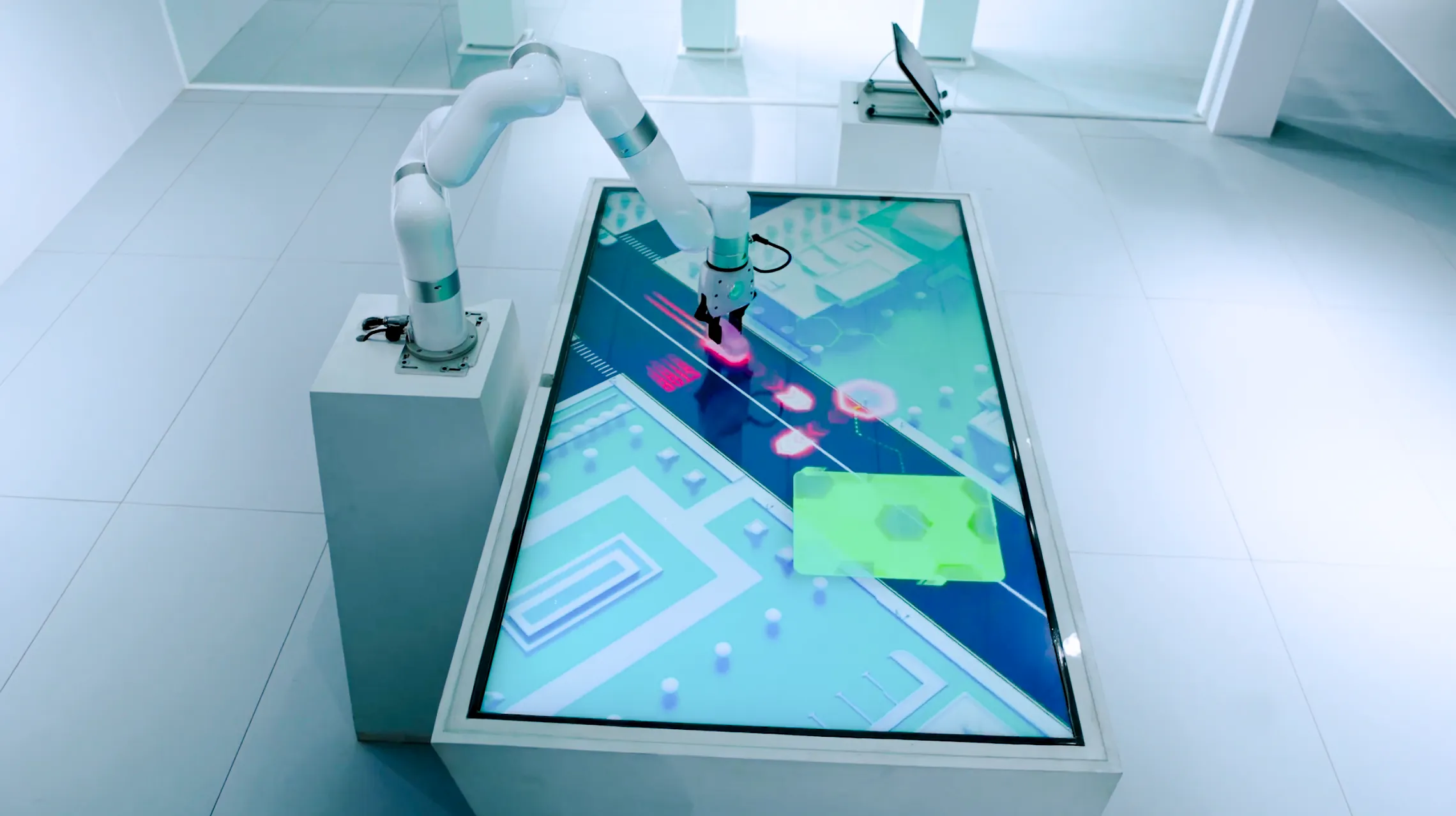
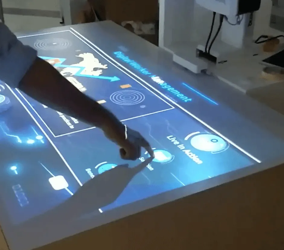
Zone 3 introduced a dial interface and gamified simulation for Protean RISE. Visitors connected modular APIs and built functional service stacks across payments, taxation, healthcare, and social security. Backend systems became a hands-on model — understood in seconds, not minutes.
Zone 4 closed with a cinematic LED theatre. Motion graphics tied leadership perspective, human data, and platform capability into one ecosystem view. The final room positioned Protean not as a service provider but as foundational infrastructure. The closing space must carry narrative authority — not just visual scale.
Digital Continuity Beyond the Physical Zones
A QR-enabled web portal and PVC ID card with AR integration extended the experience beyond the physical visit.
Visitors registered at entry, moved through tracked interaction points, and received contextual content in real time. Post-visit, they received personalised summaries and resource links. The AR marker on the physical card allowed the experience to be reactivated after leaving the space.
This is the standard for enterprise experience design — content that continues working after the visit ends.
Technical Infrastructure Behind the Content Layer
The visual layer depended on disciplined technical execution. Disparate Excel datasets were normalised into a structured, taggable system. Where live APIs were restricted, aggregated datasets supported the visualisation layer. The setup ran on client-controlled servers. Socket-based synchronisation kept screens and devices aligned. Offline and low-bandwidth logic protected continuity.
Hardware integration covered multi-screen LED walls, blended projector surfaces, iPad controllers, a haptic dial, a PVC printer with AR integration, and a zone-optimised audio system.
Content quality and technical reliability are not separate concerns. They compound each other in live environments.
Measurable Communication Outcomes
The project delivered outcomes that matter beyond aesthetics.
70,000+ static data points became interactive. The full lifecycle from identity to retirement became visible in one environment. Pan-India reach became locally explorable. The space became a working tool for sales, education, and stakeholder engagement.
These are the benchmarks worth targeting: content that reads clearly at scale, interaction systems that reduce confusion, and visual structure that carries real business meaning.
For brands building or rebuilding experience centres, Ink In Caps works at this intersection — translating complex narratives into structured, high-impact environments that hold up in front of senior decision-makers and perform across both physical and digital touchpoints. If your next environment needs to do more than impress, that's the conversation worth having.
About the Author

SEO Executive
MORE FROM OUR CREATIVE MIND
 Get Everyone's Attention With These Amazing Experiences
 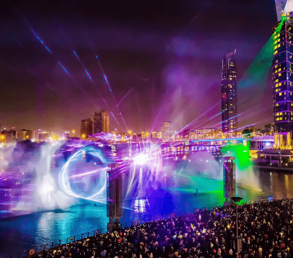 Is 3D Projection Mapping The Future Or The Present?
 About the Author
SEO Executive
MORE FROM OUR CREATIVE MIND
Get Everyone's Attention With These Amazing Experiences Is 3D Projection Mapping The Future Or The Present?  Protean —
 Scam 2026: HDFC Securities' AI That Dared You to Win
 Contact Us Now: