.CNhas5IL_ZqBJiz.webp)


Motion Design Principles for Large-Format Immersive Screens

Large-format screens require different design thinking than standard displays. Scale changes perception. Distance affects readability. Motion behaves differently when projected across 20 feet versus 20 inches.
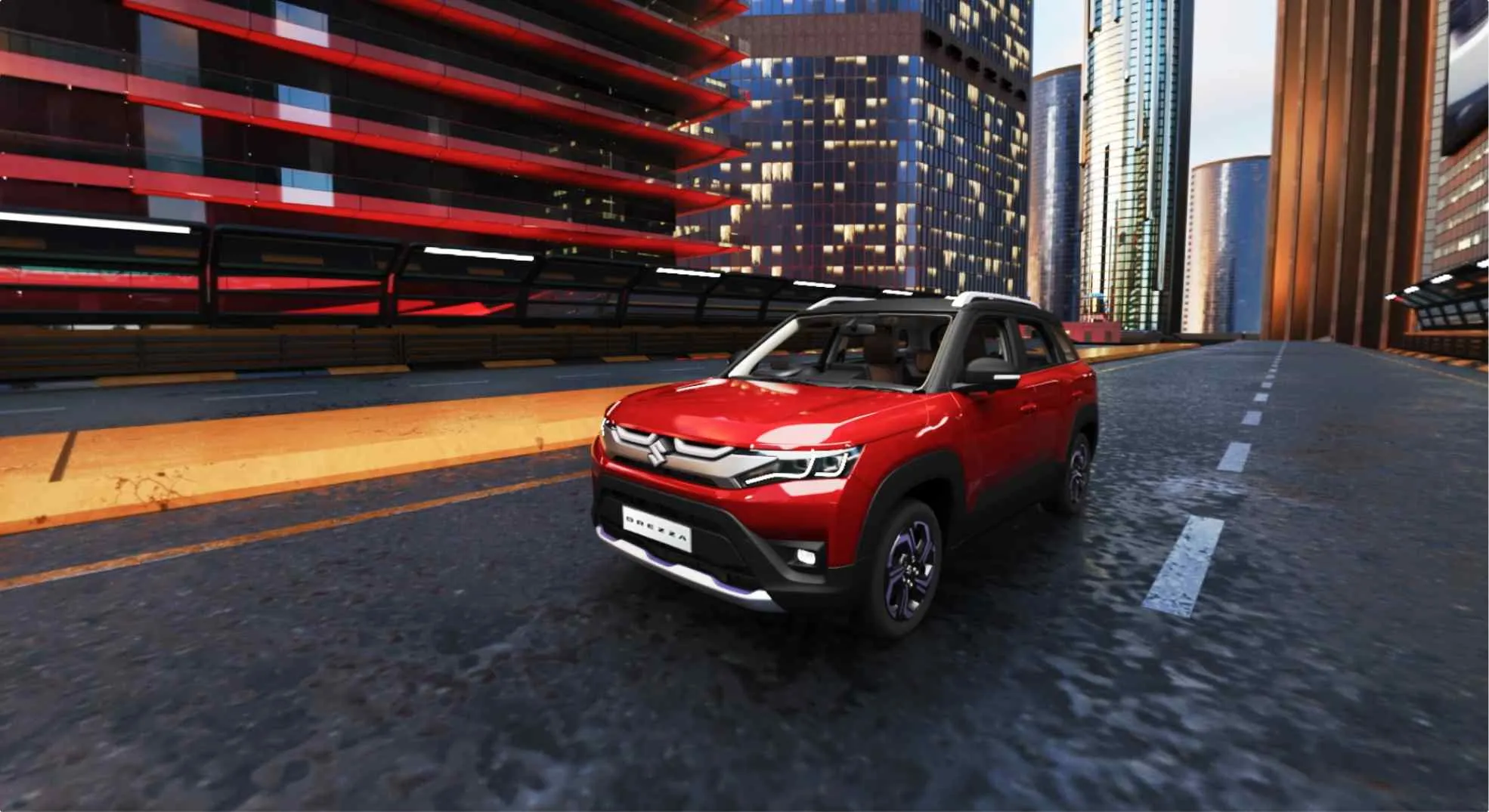
Brands invest heavily in immersive installations—LED walls in retail spaces, projection-mapped product launches, multi-screen Experience Centers. Yet many underperform. The content looks impressive on a laptop. It fails in the actual space.
The gap isn't creative vision. It's technical precision and contextual design.

Scale Changes Visual Perception
Big screens demand bold choices. Thin typography disappears. Complex compositions fragment. Subtle gradients flatten under ambient light.
Design starts with legibility. Use high-contrast layers. Keep type large and messaging brief. Build geometry that reads from 30 feet away, not 30 inches.
Field-of-view matters. Viewers don't scan large screens the way they scroll phones. Place primary content in zones they naturally occupy. Secondary elements can activate peripheral areas, but critical information stays center-mass.
Each frame must communicate a single idea. Visual hierarchy collapses when too much competes for attention across a broad surface.

Depth and Spatial Composition
Immersive surfaces benefit from clear focal planes. Depth cues guide the eye and create visual order.
Foreground anchors calls-to-action. Midground establishes product context. Background sets mood and atmosphere. This layering uses parallax, occlusion, and directional lighting to build hierarchy without clutter.
Physical architecture dictates placement. Map content to structural seams, columns, sightlines. Align motion with the rhythm of the space itself. Mismatched perspective across panels breaks immersion instantly.
Consistency in vanishing points prevents visual fatigue and maintains coherence across multi-panel installations.

Timing and Motion Language at Scale
Movement pacing shifts with distance. Fast cuts that work on screens feel chaotic on walls. Slow easing curves read better across physical space.
Acceleration matters. Gradual speed changes hold attention. Abrupt snaps overload perception and reduce message retention.
Context defines tempo. Lobby screens serving passersby need short loops with quick comprehension. Seated audiences in theaters require slower, more deliberate cycles.
Modular motion units simplify production. Build reusable clips with standardized durations. This approach enables easier scheduling, faster updates, and reliable synchronization across multiple displays.

Color Strategy and Visual Clarity
Large surfaces amplify color issues. Viewing angles shift hue. Ambient light washes out contrast. Screen types introduce bloom or banding.
Limit your palette. Two to four dominant colors reduce noise. Reserve accent colors strictly for interaction cues or critical CTAs.
High contrast separates product imagery from backgrounds. This isn't aesthetic preference—it's functional necessity for readability.
Calibration happens in situ, not in the studio. Test under actual lighting conditions with the specific hardware you'll deploy.
Performance and Hardware Constraints
Motion design that ignores technical limits fails during installation. GPU budgets are real. Render pipelines have thresholds.
Optimize from the start. Use texture atlases and sprite sheets. Bake lighting where possible. Reduce overdraw. Limit particle density.
Shader effects often outperform polygon-heavy models. Frame-rate-aware timing ensures animations hold integrity whether running at 60fps or lower refresh rates.
Technical constraints aren't creative obstacles. They're parameters that guide efficient, reliable execution.
Content Architecture and Asset Pipeline
Large-format projects require structured workflows. Clear asset organization reduces iteration time and minimizes errors during tight installation windows.
Modularize by function. Separate branding assets from product media, UI overlays from environmental effects. This segmentation enables faster updates without rebuilding entire sequences.
Naming conventions aren't bureaucracy—they're production insurance. Include aspect ratio, duration, and render settings in filenames. Add metadata that supports version control and quick retrieval.
Automated preview tools accelerate stakeholder approvals. Lightweight renders for review reduce the friction between creative iteration and business sign-off.
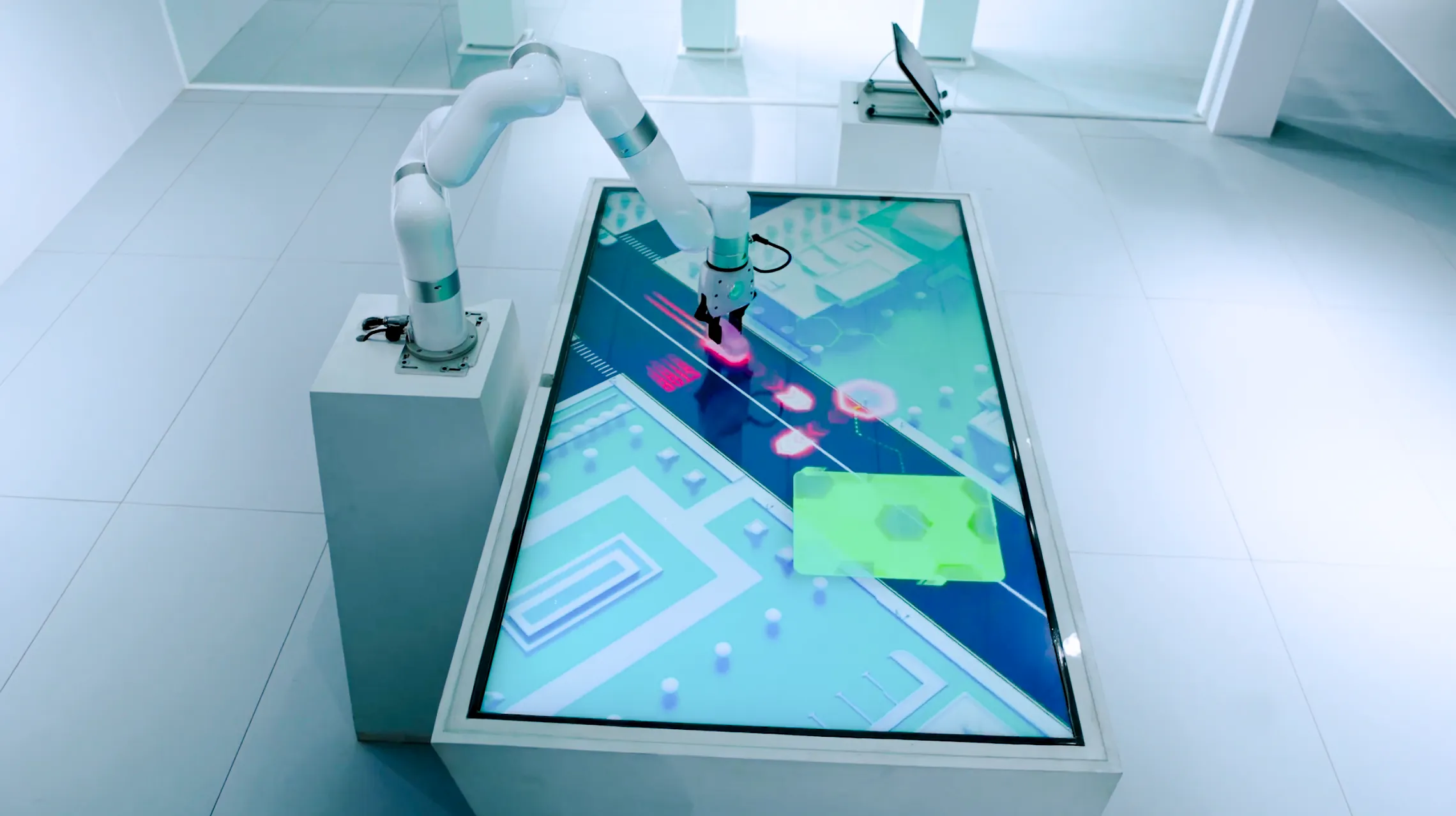
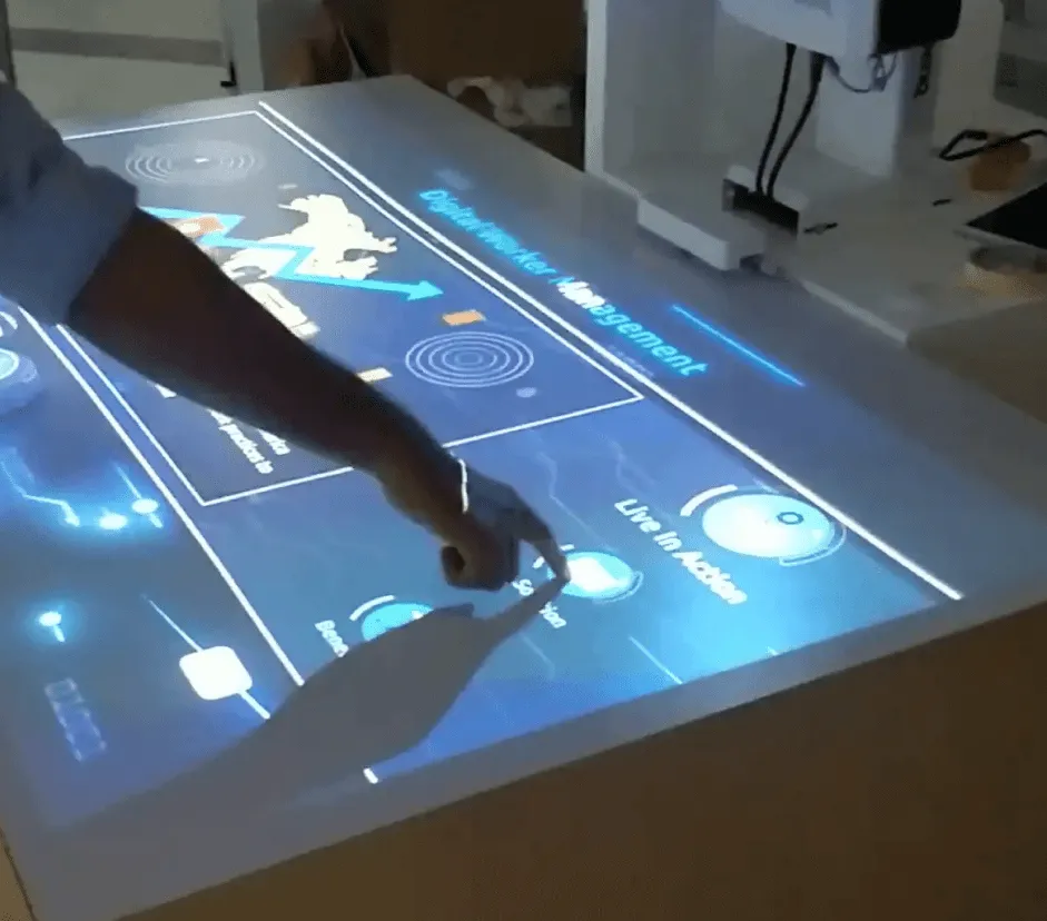
Multi-Screen Synchronization and Interactivity
Installations with touch sensors, motion tracking, or multiple synchronized surfaces add complexity. Design must account for input latency and clock drift.
Build tolerant interactions. Visual feedback should mask sensor delay through smooth transitions. Immediate hard cuts expose technical lag.
Centralized timing systems keep multi-screen content aligned. Intentional stagger creates perceived motion. Accidental drift destroys coherence.
Always include fallback states. Static loops or safe content modes keep the installation functional during sensor failures or network interruptions.
Measurement and Business Outcomes
Immersive screens are business tools, not art installations. They exist to drive engagement, extend dwell time, improve recall, and lift conversion.
Define KPIs before design begins. Map visual choices to measurable outcomes. Bold CTAs should correlate with interaction rates. Pacing should align with measured attention spans.
Instrument your content. Use sensor analytics or playback logs to validate performance. Data reveals what works and what needs adjustment.
Iterate based on the highest-value metrics first. Creative refinement without measurement is guesswork.
Delivery That Reduces Risk
Successful large-format motion design balances craft with operational discipline. Readable typography at scale. Spatially accurate depth. Performance-optimized media. Modular content for rapid updates. Robust monitoring and fallback systems.
These aren't creative nice-to-haves. They're production fundamentals that determine whether your installation delivers value or becomes a maintenance liability.
Brands deploying high-investment screens face real risk—technical mismatch, unreadable motion, content that looks good in pitch decks but fails in practice. The solution lies in design principles grounded in scale, timing, hardware reality, and measurable impact.
For projects requiring technical precision alongside creative execution—from motion language development through integration and post-deployment analytics—Ink In Caps builds immersive experiences with production-grade reliability. Reach out to evaluate your site, align creative strategy with hardware capabilities, and establish metrics that connect directly to your business objectives.
About the Author

SEO Executive
MORE FROM OUR CREATIVE MIND
 Get Everyone's Attention With These Amazing Experiences
 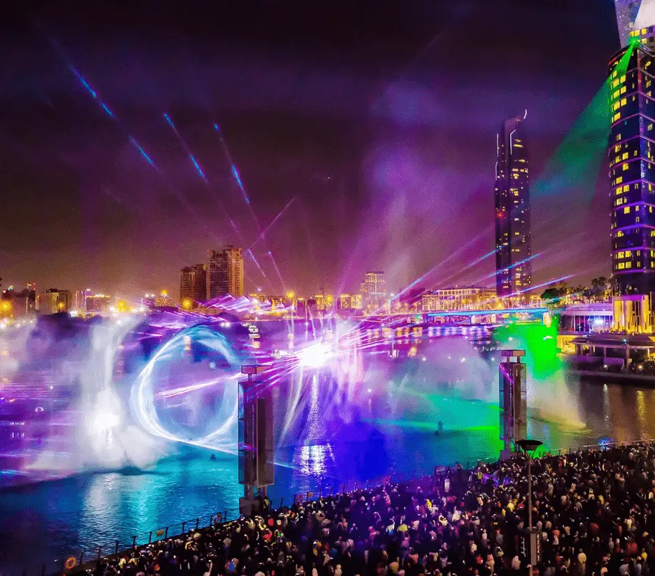 Is 3D Projection Mapping The Future Or The Present?
 About the Author
SEO Executive
MORE FROM OUR CREATIVE MIND
Get Everyone's Attention With These Amazing Experiences Is 3D Projection Mapping The Future Or The Present? 


Contact Us Now: