.CNhas5IL_ZqBJiz.webp)


Immersive Installations in Entertainment: Lessons from WAVES 2025 Tech Showcase


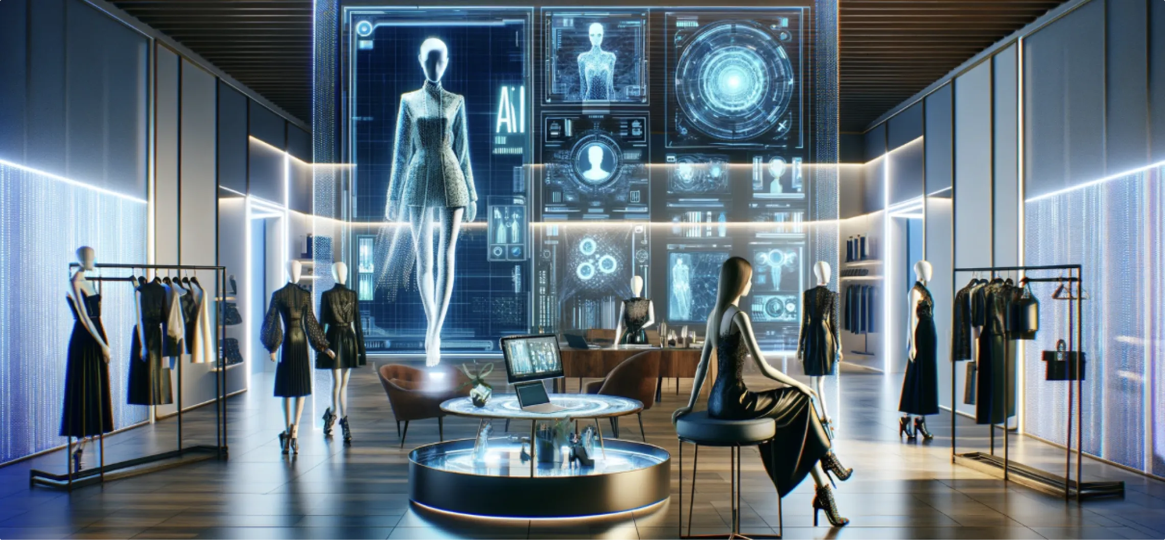
WAVES 2025 in Mumbai was more than a rally for the media and entertainment community — it was a live laboratory where narrative, engineering, and place-making met head-on. Between May 1–4 the convention floor at the Jio World Convention Centre became a proving ground for installations that did more than dazzle: they anchored stories, guided attention, and turned casual browsers into listeners and participants. The Bharat Pavilion and the Jio Pavilion curated by Jio Star offered five distinct immersive zones that combined spectacle with purposeful design, drawing industry leaders, cultural custodians, and a very large, engaged public.
For marketing leaders, brand heads and experience directors, the exhibit provides a compact playbook: how to design installations that scale emotionally, perform technically, and deliver measurable business outcomes. Below I break down the concrete lessons from the showcase — designed to be directly applicable for anyone planning an experience centre, product launch, or brand activation.
Lesson 1 — Design with narrative at the core, not ornamentation

The strongest moments at WAVES didn’t come from raw pixel density or novelty alone; they came when content and structure worked together to tell a single story. The Infinite Curved LED Anamorphic Wall, for example, didn’t exist merely to show high-res footage — it told the ten-year journey of the Pro Kabaddi League through a motion anamorphic illusion that made history feel immediate and physical. That choice — use a highly specific visual technique to serve a focused story — is the difference between “pretty” and “memorable.”
Practical takeaway: pick one clear narrative for each zone and choose the technical medium that amplifies that narrative. Don’t layer competing stories across the same canvas.
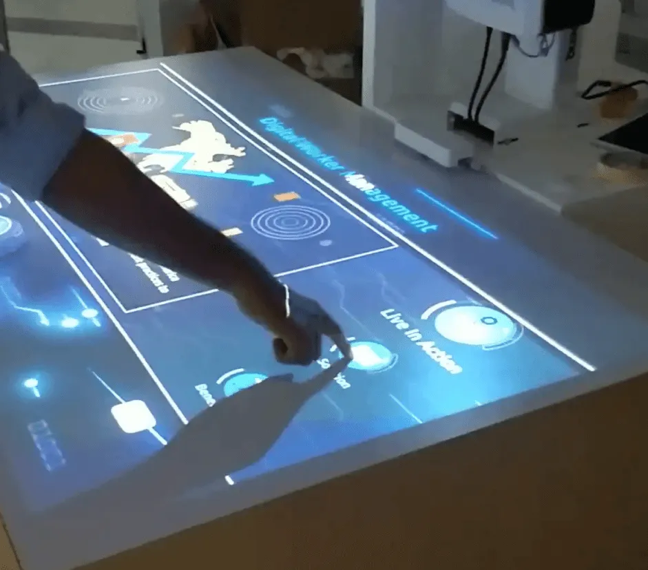
Lesson 2 — Make interactivity intuitive and frictionless

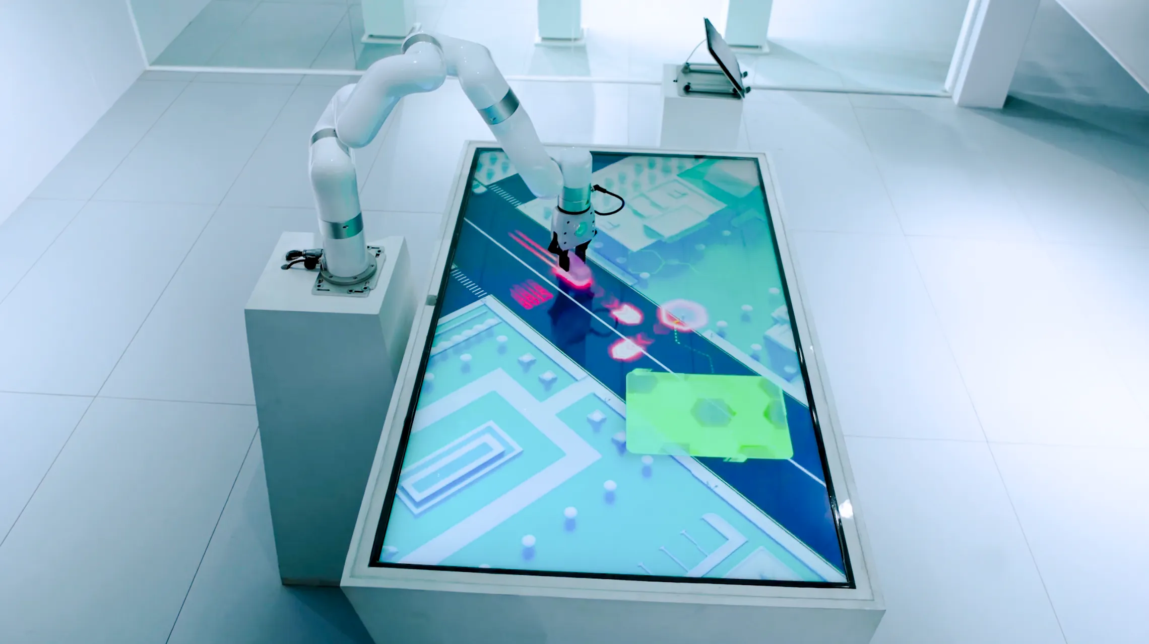
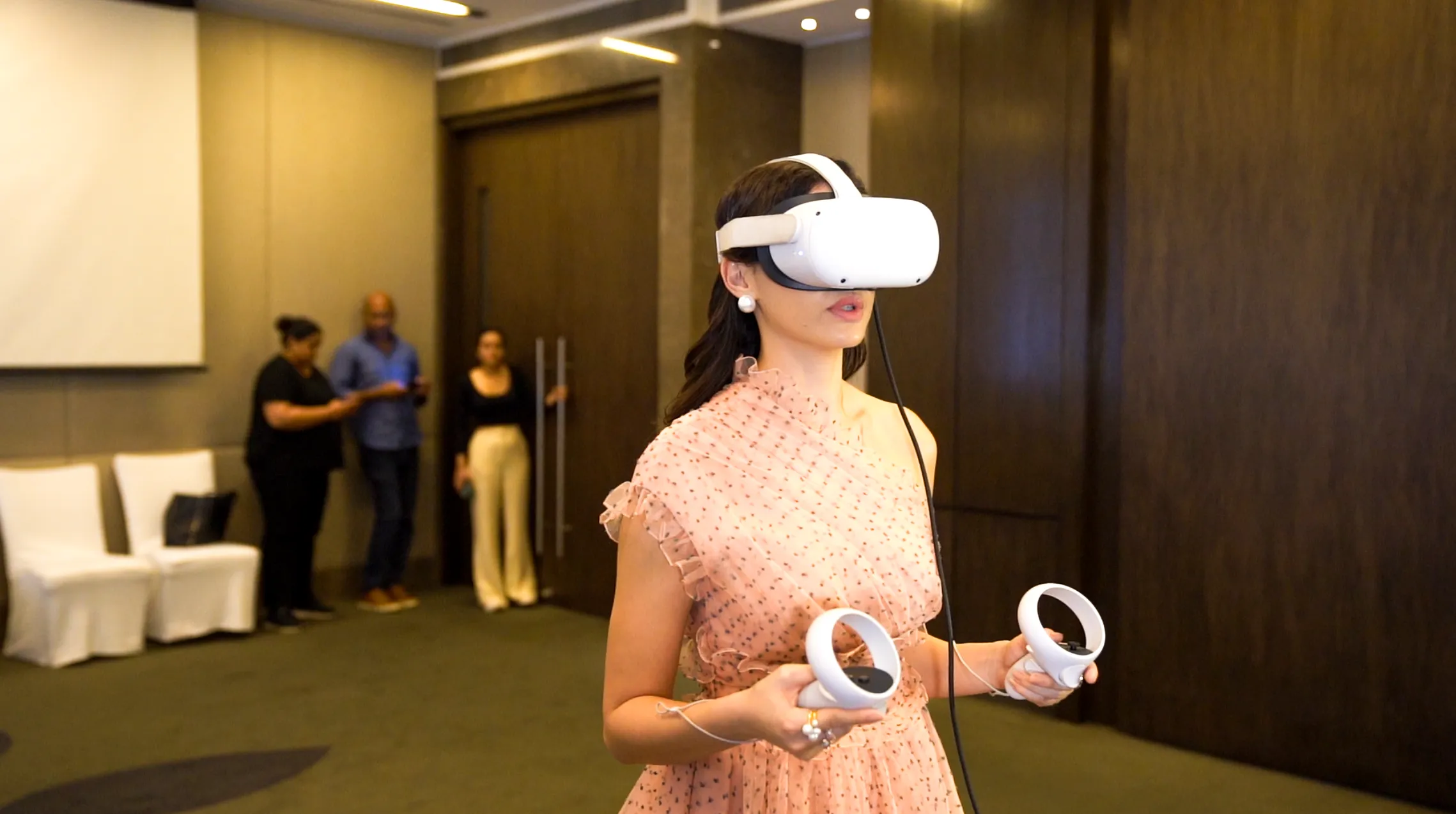
High engagement at the Jio Pavilion relied on interaction that felt natural. The gesture-based interactive table used Leap Motion technology to let visitors explore Star Sports’ archive through hand movements — no tutorial, no login, no awkward “how do I use this?” By removing friction, the installation increased dwell time and encouraged repeat exploration.
Practical takeaway: when you add interactive layers, design for first-time users. Natural gestures, proximity triggers, and obvious affordances outperform complex input schemes in open, noisy environments.
Lesson 3 — Use mechanical movement as a storytelling device

The kinetic LED wall at the Jio Pavilion demonstrated how motion — not just imagery — can convey scale and structure. Independently moving LED tiles created a sense of constellation and hierarchy, communicating the reach and plurality of a media network in a single visual gesture. Similarly, the bespoke C-shaped LED wall framed cultural content (a Mahashivratri sequence) using physical form to heighten context. These are examples of using hardware motion as a narrative instrument, not as a gimmick.
Practical takeaway: consider the role of physical behavior — tile motion, rotating surfaces, animating structures — as part of the editorial toolkit. It’s a subtle but powerful way to encode meaning.
Lesson 4 — Calibrate spectacle to human scale

Spectacle captures attention; human scale holds it. The Holobox hologram at WAVES — a custom rig with an intense, disciplined lighting setup running into the hundreds of thousands of units — produced a realistic presence that rewarded closer inspection while still reading clearly from a distance. The team calibrated light, perspective and timing so that visitors could move from peripheral notice to close engagement without sensory overload. That calibration allowed figures, stories and rituals (including narrated Ram Katha sequences) to land in a way that felt respectful rather than theatrical.
Practical takeaway: design sightlines and lighting so experiences work across three distances — glance, browse, and close inspection. If an installation loses meaning as a visitor approaches, it needs retuning.
Lesson 5 — Anchor creative risk in operational rigor

Large installations demand rigorous engineering and rehearsal. The project combined high-fidelity content with complex hardware — from metal fabrications for the C-shaped wall to independently powered LED tiles — and that requires a production mindset: checklists, redundancies, calibration runs, and a strong onsite ops team. The result at WAVES was not only a striking presentation but reliable, consistent performance across long show hours and heavy footfall.
Practical takeaway: treat launch day like the tenth day of a month-long activation. Expect volume, schedule burn-in, and design for maintainability and uptime.
Lesson 6 — Measure signals that matter, not everything
A headline stat from the pavilion: more than 100,000 visitors and an average dwell time north of 12 minutes in the Bharat Pavilion zone. Those numbers are useful because they’re paired with qualitative indicators — significant dignitaries observing installations and focused, story-based content that invited deeper engagement. Metrics should map to the business goal: attention quality, not vanity reach.
Practical takeaway: prioritize a small set of KPIs such as dwell time, repeat visits, and conversion to a next action (lead capture, content download, ticketing). Use heat maps, session logs for touch tables, and timed observations to understand behavior — not just raw footfall.
Lesson 7 — Respect cultural context and editorial sensitivity
The Bharat Pavilion framed its content under the theme “Kala to Code,” intentionally coupling cultural heritage with contemporary media narratives. When your content connects to ritual, history or national sentiment, editorial discipline matters: voice, tone, and the handling of sacred content must be carefully considered to avoid misinterpretation. The holographic narration of Ram Katha at the pavilion is an example of high-visibility cultural content executed with clear editorial oversight.
Practical takeaway: when dealing with heritage or faith, build an editorial committee and run sensitivity reviews. Involve subject experts early to ensure authenticity and respect.
Lesson 8 — Scale for partnership visibility and shared IP
WAVES is an ecosystem event: ministries, broadcasters, start-ups and platform owners. The Jio Pavilion and Bharat Pavilion showed how partner narratives can coexist — corporate storytelling alongside public cultural themes — without diluting either. For brands, this means designing shareable assets (short loops, branded micro-experiences, press-ready b-roll) that partners can amplify. That multiplies reach without additional onsite footprint.
Practical takeaway: produce modular assets that serve three audiences — the onsite visitor, the online viewer, and partner channels. Short vertical edits, stills and interactive embeds extend the exhibit beyond the floor.
Behind the scenes: how they made it work
The technical notes from the pavilion reveal a disciplined convergence of craft and computation. The anamorphic sequences relied on precise mathematical offsets and physical curvature to produce 3D illusions; the holobox required bespoke rigs and exacting lighting counts; the gesture table blended motion sensors with a UX surface designed for quick, discoverable interaction. Each of these choices was a trade-off: fidelity versus robustness; spectacle versus maintainability. The team’s approach favored repeatable solutions that could perform reliably under continuous public use.
For project leaders, the hidden cost is almost always in iteration and calibration. Expect at least three cycles: concept proof, integrated technical dry runs, and live stress tests. Budget those cycles explicitly.
What this means for brand experience strategies
Prioritize editorial clarity. Build each physical installation around a single, defensible story.
Design for discovery. Make interactions legible in three seconds; make rewards meaningful in three minutes.
Architect for durability. Plan for continuous use and quick maintenance access.
Measure meaningful engagement. Dwell time, repeat visits, and post-visit actions tell you more than headline reach.
Create modular media assets. Your exhibit should fund at least three downstream pieces of content for earned and owned channels.
A note on partnership and agency collaboration
When a project scales like the WAVES pavilion — multiple zones, institutional partners, cultural content and celebrity involvement — the execution model changes from vendor to co-owner. Tight collaboration between creative directors, engineering leads, and institutional stakeholders enabled coherent storytelling without compromise. For enterprise marketing teams, that means choosing partners who can demonstrate both creative vision and field engineering discipline.
At Ink In Caps, our approach aligns with those operational realities: we focus on marrying precise technical frameworks with editorial integrity so that installations perform as reliably as they captivate. We aim to deliver not just moments of attention, but measurable pathways to business outcomes — from lead capture to brand lift.
About the Author

SEO Executive
MORE FROM OUR CREATIVE MIND
 Get Everyone's Attention With These Amazing Experiences
 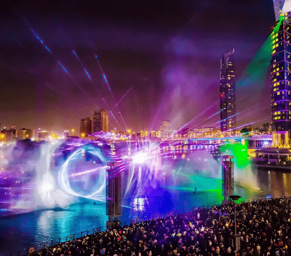 Is 3D Projection Mapping The Future Or The Present?
 About the Author
SEO Executive
MORE FROM OUR CREATIVE MIND
Get Everyone's Attention With These Amazing Experiences Is 3D Projection Mapping The Future Or The Present? Contact Us Now: